VALUE
What is the value?
Value is the relative degree of lightness and darkness in a design element. Also, value is defined as the relative lightness or darkness of a color.
It is an important tool for the designer/artist, in the way that it defines form and creates spatial illusions. Contrast of value separates objects in space, while gradation of value suggests mass and contour of a contiguous surface. In the drawing on the right, value contrast separates the artichoke from the background, and the separate leaves from one another, while gradation suggests the curves of leave surfaces and of the whole form.

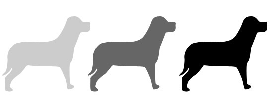
As you can see in the example above, the value of each dog is relative to the other dogs and also to the background they’re placed on. The greater the difference in value between the object and it’s background, the greater the Contrast. Value is a very powerful tool when creating the look and feel of a design.
Why we need value in design?
Increase/Decrease Contrast
The greater the difference in value between an object and its background, the greater the contrast


Create Movement
Objects of the same value create a static design with all objects equal in visual importance. Introducing varying values gives the page a more dynamic appearance and creates a 'pecking order' among the objects. Some stand out while others recede.

Lead the Eye
By creating a pattern of dark to light values, even when the objects are equal in shape and size, it leads the eye in the direction of dark to light.


How to use value element in pinceple of design?
The strongest contrast available in art is the contrast between black and white. This may be partially accounted for by the mechanics of vision. The rods and cones of the eye both respond to value but only the cones respond to color (hue). The area in a composition with the greatest contrast, with or without color, will be the most visible.
Look at the examples below and ask yourself which bars stand out the strongest against their surroundings.
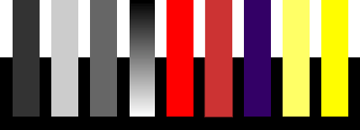
The first, (dark) bar is clearly visible against the white background but barely visible against the black. The second, (light) bar 's contrasts are the opposite. The third (gray) bar is equally visible against both black and white but not as visible as the high contrast areas of the first two bars. The fourth (black to white) bar has maximum contrast at either end.
The colored bars add hue and saturation as considerations. The two red bars are middle values and contrast equally with black and white. The brightness of the red, however, makes it more visible.
The violet bar corresponds to the first dark gray bar in contrasts -- high against white but low against black. The two yellow bars correspond with the second light gray bar in contrasts. The brighter yellow does make that bar more visible even against the white -- but that contrast is still low and can not be depended on to be very noticeable. Against the black, though it has both strong value contrast and strong color appeal.

Both the black and white bars have equal contrast against the bright middle value colors. The middle value gray bar, however has little contrast and while visible is not very noticeable.
The red bar is quite visible against the green but disappears against the red background. The light and dark red bars are easily visible against both backgrounds.
The green bars have the same contrast relationships -- visible against the different hue but more visible against both backgrounds when there is also a value difference.
It is easy to over estimate the visibility of same or similar value colors. When the shapes are simple and large, like the bars the red on green and green on red contrast seems adequate. When the images are more complex and demanding the situation changes somewhat.
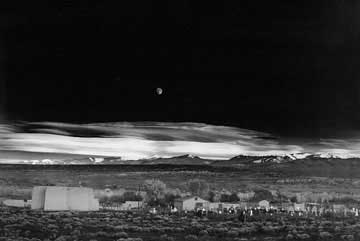
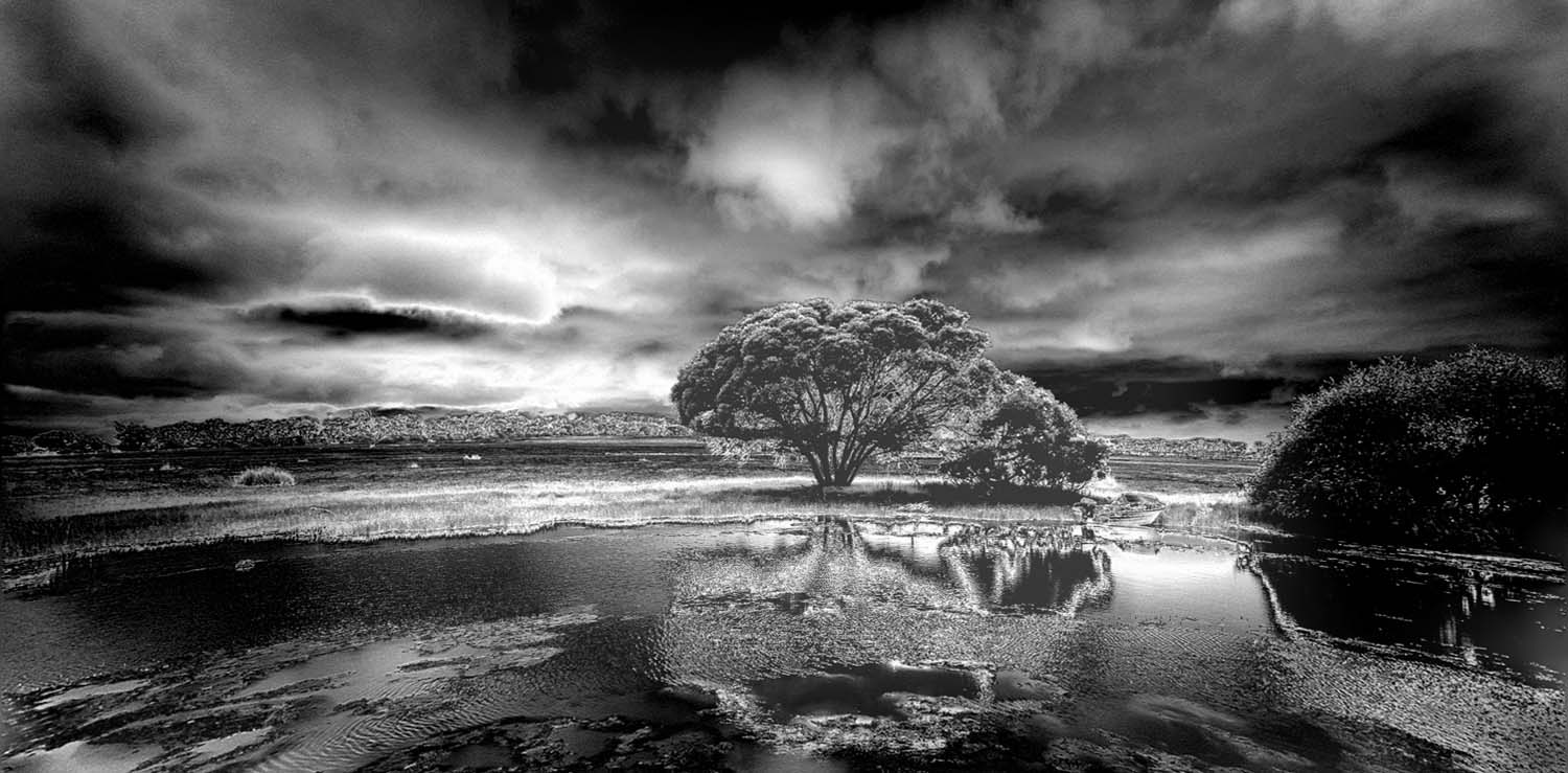
In both of these photographs Ansel Adams uses the complete tonal range at his disposal. His images always include deep, rich blacks. He usually uses the full range to white, even in a dark image, unless he is trying to indicate a misty day.
The effect of black areas in an image that includes whites gives the feeling that the blacks are "blacker" than if most of the image were black and no areas were very light. The reason is that the tonal range of the image provides the necessary contrast that allows you to see what the artist wants you to see.
The same is true of the whites. When less than the entire tonal range is used the image can look "flat" and it is harder to generate interest.
Similarly, a predominantly light image will seem "lighter" and more positive than a predominantly dark image. The tonal range helps set the mood.
In conclusion,In both of these photographs Ansel Adams uses the complete tonal range at his disposal. His images always include deep, rich blacks. He usually uses the full range to white, even in a dark image, unless he is trying to indicate a misty day.
The effect of black areas in an image that includes whites gives the feeling that the blacks are "blacker" than if most of the image were black and no areas were very light. The reason is that the tonal range of the image provides the necessary contrast that allows you to see what the artist wants you to see.
The same is true of the whites. When less than the entire tonal range is used the image can look "flat" and it is harder to generate interest.
Similarly, a predominantly light image will seem "lighter" and more positive than a predominantly dark image. The tonal range helps set the mood.